The following essay accompanies Hand Papermakingʼs fourteenth limited-edition portfolio titled The Language of Color. Published this year, the collection of sixteen works was juried by artist Hong Hong (whose jurorʼs statement is included in the portfolio booklet). Images of all the portfolio works are reproduced here with Bridget Donlonʼs insightful essay. ––Ed.
In the summer of 2022, NASA released images from the James Webb Space Telescope (JWST). For the first time, humans can see distant galaxies in sharp focus expanding what is known about the unknown as researchers use the data to better understand the cosmos. These vibrantly colorful images inspire awe with billowing clouds of stardust in front of a celestial blanket of lens flare twinkles.
The colors in the JWST images are man-made. Since the telescope collects photons in wavelengths outside of human visual perception, the data is translated into visible light using a palette developed for the Hubble telescope, the JWST predecessor. Certain emissions correlate to specific colors: Sulphur II to red, Hydrogen-alpha to green, and Oxygen III to blue. These are specific choices by individual programmers that influence the interpretation of the images. The perception of color and the emotional and symbolic associations that color creates are as significant a tool as the telescope itself.
One single color can carry many meanings. Take red, for example: in marketing, the classic Coca-Cola can will attract the eye to make it stand out on a shelf of options. A fire engine is easy to spot during an emergency. Berries in a bush can signal poison to humans who otherwise might eat them. The color field of Barnett Newman’s Vir Heroicus Sublimus intentionally overwhelms the viewer’s field of vision. Marketing, civic design, nature, and artists use the same color to activate the subconscious, convey an idea, or evoke a specific feeling.
Leah Frankel’s Red Lens invites viewers to consider the color red and all of its possibilities. An aperture of a transparent red acetate sheet is sandwiched between imperfectly aligned double-couched sheets of mottled reds, calling to mind a geode and juxtaposing handmade against machine-made, natural against industrial. Peering through the sheet, like one half of a retro pair of 3-D glasses, everything within its periphery changes, and so too its interpretation. A crisp white bedspread becomes a cotton-candy pink. A clear sky becomes a hellscape of a horror film.
In a similar meditation on a single color, Maria Amalia works intuitively with the color indigo, creating marks that refer to specific memories of trips in Honduras, her country of origin. An indigo gradient suggests a dusky landscape, and the color itself calls to other histories such as the seventeenth-century transatlantic trade routes through Central America. Montañas del Añil (Indigo Mountains) is a collage that has the weight and delicacy of a precious family heirloom.
The colors in Ripples (for Salem) by Anela Ming-Yue Oh call forth associations with multiple senses. The turmeric yellow brings to mind the taste of a warm curry; the combination of green and blue evokes the sound and feel of plant life in a lapping body of water; and bold magenta carries the scent of a tropical flower. These associations are personal, rippling from one’s own memories across time, culture, and people. In the work, you sense a quickness of stenciling and a human hand, drawing a parallel to handcrafted Batik fabric from the artist’s Malaysian Chinese cultural heritage.
The power of fabric to convey meaning is also used to effect by Henry Obeng for his piece Likeness, in which Wisconsin Badger red cotton t-shirts were pulped to become the base sheet for the cyanotype print of a plant-specimen document in the research collection of the Wisconsin State Herbarium. The image itself is abstract, though petals and stems are visible. The soft, thick red paper feels like something discovered in a dark library, hidden for years and uncovered to reveal clues to a mystery. The text is small but legible. It identifies the Latin name of the plant and its common name, the collector, locality, and habitat; that it is a shrub and also an herb, collected Jan 13, 1957. The text gives way to a small map with an arrow pointing to the topography of Ghana (Obeng’s country of origin). One wonders, what is this plant doing in Wisconsin? The reproduced document serves as a metaphor for self-portraiture and telling stories of migration and identity.
Gina Louise Fowler’s untitled folio also recycles textiles to generate pulp. The sustainability effort imbues the material with the memory of its previous life to be given new meaning. The book-style format of the piece is familiar, at conflict with the purposefully opaque content. The cutouts on the front and back of the folio expose the double-wide sheet that opens to reveal a multitude of mottled colors. The geometric forms approach language, looking like an unintelligible matrix of runes, a redacted letter, a ransom note, or a crack in a wall to another dimension. This construction plays on the ability for both language and color to drive personal interpretation, and speaks to the limits of language against human experience.
Language itself is subject to interpretation and can be given alternative contexts. With Henceforth, Sue Carrie Drummond draws upon elements of Nathaniel Hawthorne’s 1850 The Scarlet Letter to reflect upon the perpetually complex nature of femininity and outdated but persistent expectations to perform it in public. A beautiful gradient from a cherry red to a dark charcoal black is the base of a misty veil of watermarked lace, a material that is paradoxically strong despite its delicate appearance. The waxy surface resembles votive candles that have melted and pooled, alluding to ecclesiastical rituals and adornments. The use of specific colors and patterns combine to signify social mores, structures, and other myriad associations.
This particular power of language, pattern, and color is explored in the broadside Laundry List by Katharine L. DeLamater & Colleen Lawrence. The piece takes the appearance of a classic gingham cloth, a textile used for many domestic purposes. Strips of blue, white, and green pulp are precisely laid in a woven grid creating a field for a letterpress poem that brings to mind a backyard gathering free of devices, rich in time to spend appreciating “pluckable clouds” and “dream raspberries.” These abstract fragments elicit visual imagery without depicting them at all, much like color’s ability to communicate beyond language.
Genevieve Lapp’s Just a Thought eschews technical precision for intuition to ruminate on the formation of thoughts, and grapples with the concept of implicit bias. A dark void sits at the center of a pale field formed by layers of thin abaca over a weightier base sheet. The center almost does not hold; some areas are nearly transparent with mere fibers holding them together, similar to a watermark on paper currency. The membrane-like quality invites one to hold it up to the light, like a sfumato landscape inside a small antique cameo holding mysteries for contemplation. While grayscale is an alternative to the full spectrum of color, it carries no less meaning and associative power. In this case, the artist intends for the range of tones to represent the draining of unwanted thoughts.
Kerri Cushman’s Tupperware Party No. 4 communicates with no color at all. Without the full spectrum, there are still many tools to convey ideas. Instead of pigmented pulp, the work makes use of pattern, shadow, and texture, becoming almost sculptural with deep impressions and sharply raised embossments on the surface of the paper. Tactile fragments of lace doilies and the alphabet in Helvetica typeface imply meaning, in this case a remembrance of the artist’s grandmother who was one of the women seeking financial independence through Tupperware parties of the mid-twentieth century, and who late in life suffered illnesses that left her with few spoken words. In this way, the blank white paper is full of narrative.
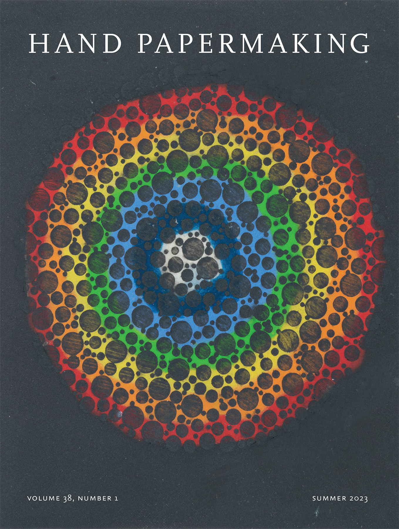
Ironically, while white lacks color it is actually the reflection of all colors of the visible spectrum. The human eye is only able to perceive the seven colors of the rainbow—red, orange, yellow, green, blue, indigo, and violet. This naturally occurring phenomenon has been a transcultural symbol throughout much of human history. Seeing is Believing by Susan Gosin reflects on the connection between what is seen by the eye and what is perceived by the mind using color-blindness test patterns devised in 1917 by Japanese ophthalmologist Shinobu Ishihara. In the portfolio piece, a semi-translucent rainbow circle sits below a field of black spots, emanating through like a brilliant cut geode or an oil stain on asphalt. The rainbow as a unit of color lends itself to these interpretations, just as individual colors have their own inherent associations.
Green can have negative connotations of greed and envy, or of being naive, but it is also the most emblematic color of the natural world. Oskaskosîwinâkwan is a Plains Cree phrase meaning “it looks green” and provides the title for Derick Wycherly’s pressure print. Layers of mossy, springtime, new-growth greens lie interconnected atop a looser background of blues and darker greens. These layers of colors are visible reminders of the cycle of life. The tactile quality of the paper is like tree bark or dried leaves, a physical connection between the artwork and its origins as flowers and plants that derive the paper’s fibers.
Some artists point directly to the natural world in their use of materials. A delicate untitled trifold by Rebecca Alm & Amanda Degener embeds buckthorn root, an invasive species that has an attractive, delicate quality, in abaca paper; the plant’s presence implies odious harm. A red artery of pigmented pulp runs down the center of the closed artwork, which opens like stretched arms, the red outlining its edges. When open, soft blues and negative space imply the sky with gold fronds stenciled on top connecting earth and sky, though the specific color choices can carry other interpretations ranging from serenity to sadness; ultimately they work together formally to balance the eye.
Megan Singleton strikes a similar aesthetic balance with Kindred Tones. A nubbly, earthy surface resembles a central moon over a horizon in a dark field of a desert landscape. The texture indicates evidence of lichens, primarily reindeer moss that the artist foraged along the Bourbeuse River in east central Missouri. Along with other natural dyes, such as Himalayan rhubarb, madder and logwood, and indigo, the piece is inspired by the naturally occurring network of mycorrhizal fungi, where a lacy root system sends nutrients and messages throughout the forest, bonding different fibers together to communicate messages in parallel with papermaking.
Paper entails the alchemy of fiber and water, most often in a controlled studio environment. Ingrid Schindall used the ocean as a resource in creating Ask the Waves, equating the repetition of papermaking with the ceaselessness of the tide. Using a custom deckle box that presses into the sand and mixes pulp with ocean water, the artist followed a set of steps pouring white and blue pulp into specific corners of the box and yielding a different outcome each time based on the wave that formed the sheet. Grains of sand are embedded on the surface of the soft paper. The flow of white and the blue activates a feeling of warmth, a scent of salt, the sound of seagulls cawing, and the roar of the waves. The ripples and ridges provide a sense of motion, and of a moment caught in time.
Making pigmented pulps for pulp painting requires laborious planning, meticulous preparation, time, and experience. The artist must select and beat different types of fibers, mix in the pigments, and bring the recipe together with retention aid, sizing, and other ingredients. All of this preparation sets up perfect materials with which to improvise and let the pulp guide the creative process. Tom Balbo aims for the nature of paper to reveal its own essence in Cloud Break and follows a serial methodology to create and activate space in the picture plane. Geometric forms in shades of gray and blue sit atop color fields of yellow, teal, and navy in a balanced harmonium.
Utilizing a similar method of improvisation to different ends, Viviane Colautti Ivanova reveals the very essence of paper in Fibres de Lumière (Fibers of Light), an assemblage of colored fibers held together naturally by hydrogen bonding. Dyes derived from onion skins, red cabbage, madder, gallnut, and indigo yield fibers in magenta, royal purple, pale pink, turquoise, and greens. The individual fibers were assembled in water, overlapping and creating new meaning based on color’s relationship to emotion. These threads begin as individual parts and come together, reflecting on the link between the cosmos, humans, and nature, all tied together.
In De anima Aristotle describes color as “capable of setting in motion that which is actually transparent.” In the case of art, interpretation is set in motion by color with its ability to communicate ideas, evoke emotion, and inspire personal resonance. The Language of Color prompt has elicited a multitude of approaches to color, from the full spectrum to its lack, or a meditation on a singular hue. Paper as an art form is especially suited to the investigation of color for its vast range of applications as seen in the wide variety of works gathered in this portfolio.